Simplifying the tour planning process


CT&M's planning system is complicated.
Custom Tours creates immersive New England experiences—from Ben & Jerry's Factory tastings to apple picking at local orchards. However, managing the deadlines, contracts, and logistics of tour planning was increasingly unwieldy, and their existing website fell short.
Our redesigned platform streamlines tour planning by digitizing the entire process, enhancing team collaboration, clarifying workflows, and centralizing information access.
What's wrong with the old website?
My team conducted a design audit to identify key areas of improvement in the old website. Here's our two main impressions:
Conversations with CT&M staff
We spoke with the five members of the CT&M staff to understand their roles, walk through their work flows, and how they use the current site. Here's what they said:
"
I actually don't use the website at all. I don't think that the information is updated.
"
"
We communicate by sharing versions through email. Its hard to keep track of which is the current version.
"
"
We give multiple versions to clients. The closer we are to the tour date the more specific. If we give away too much too early that's how we get stolen from.
"
Putting it all together
We synthesized this research into a user flow to get the whole team on the same page on exactly how the planning process works. Working with our partner, we polished it to the form below which we used to scaffold our initial designs.
This element was built with Figma Make
We made three major improvements
A visual reset
Visual design wasn't a major consideration when developing the original site. The site's basic components and Arial typeface looks unfinished.
Before

Our new visual language for CT&M is clean and sleek.
We chose Inter as a modernized sans-serif that is friendly but still professional. A muted background with minimal pops of color to indicate groupings or CTAs helps guide CT&M staff and minimizes fatigue during a planning session.
After
Tour planning, simplified
As the core functionality of the site, we first focused on the process of planning a tour.
The overarching file for a tour is called a case. Within a case are usually all the different versions of an itinerary, any pocket items (contracts, images, or other files) and budget sheets.
Before
After
Dusting off the archives
I took ownership of redesigning the catalog pages, which includes the vendors, clients, local resources, tour guides, and transport operators. With the largest category including 1776 entries, there's a massive amount of information to dig through.
Before
Partner Feedback: At a Glance
The original sketches were card views, but the CT&M staff actually pushed back in favor of a list view, explaining that they prioritize seeing all the essential information (location, type of vendor, hours available, etc.) at a glance.
This was an unknown need of the CT&M staff. I didn't fully consider what was the goal of navigating a catalog—to quickly find someone/something that could fit in an itinerary. This inspired a semantic search bar, vendor category tags, and visualizing open hours, giving as much information to as needed to make a snappy decision.

The original vendor catalog greyscale designed by hand in Figma
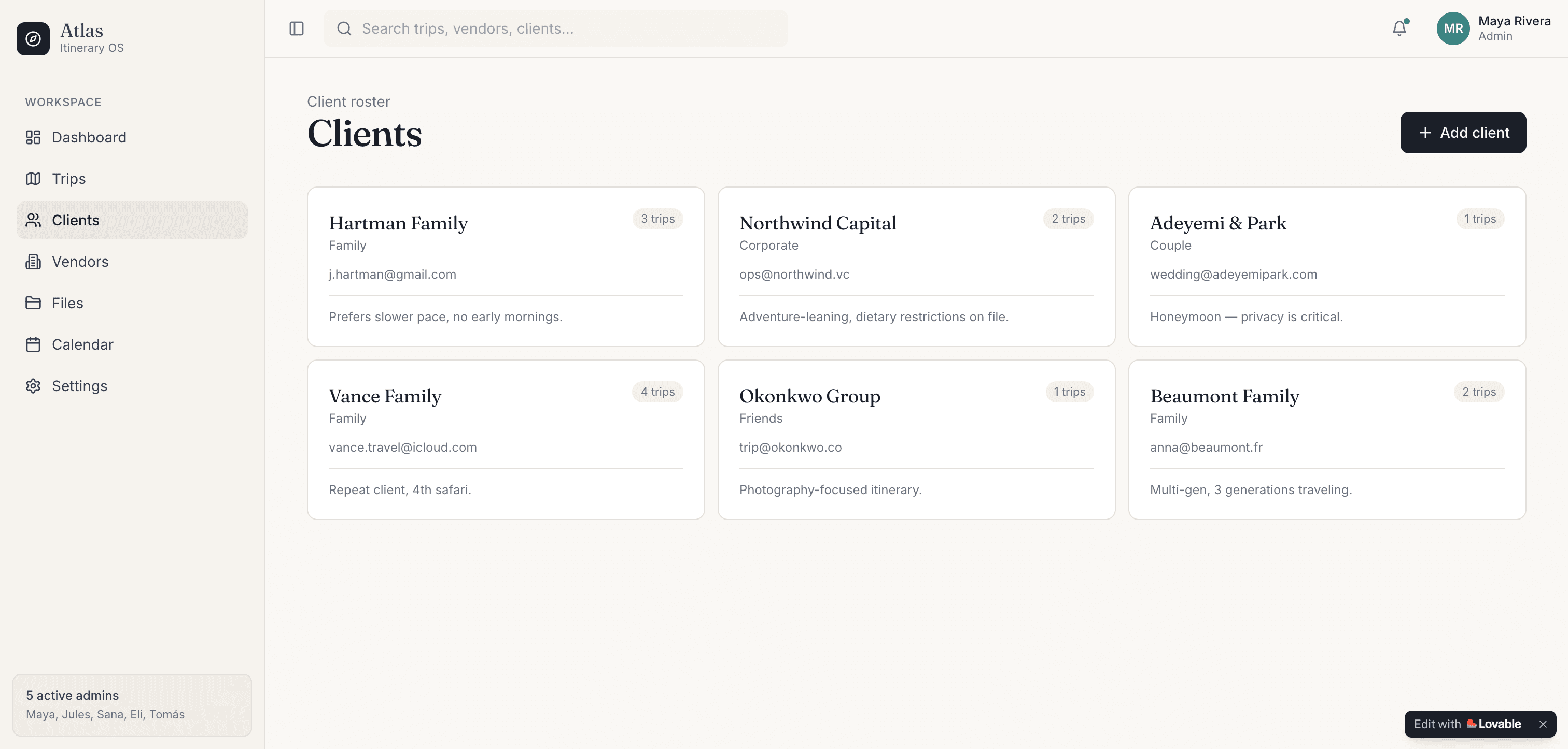
A card view for clients prompted on Lovable
We made three new features
One day at a time
"
Clients come to us with a general idea. We fill in the rest and organize everything in between.
"
Designing an itinerary is like a magnifying glass. You start with a very high-level overview (some must-see spots, a general location) and focus in to the nitty-gritty of exact times and factoring in transportation.
This inspired a new day-by-day planner. CT&M staff first pick out key locations, then other finer details like duration of visit and transportation method.
Partner Feedback: List vs. calendar view
During our sketches we introduced a calendar view for building itineraries, similar to Google Calendar where you select a time slot then attach information such as location, purpose, and other details.
Our partner was interested, but emphasized that her team is most familiar with list views and the calendar could be challenging to navigate. The designers also realized that it didn't align with the traditional workflow because staff have to decide a time slot before picking a location.
Activity duration is an element that can change drastically through the planning process. And early itineraries don't have times attached at all. This inspired us to develop the location-first day-by-day planner above.
Early explorations of a calendar view


Visualizing tour routes
"
When there's a long stretch of time between stops, I go on Google and search "things to do between [x] and [y] place".
"
"
I usually have Google Maps out on another screen to plan routes.
"
All the CT&M staff members mentioned having Google Maps open while planning routes. So we decided to bring maps into the itinerary planner. Each day's route is visually distinct. And the map automatically updates as you work.
CT&M members use the map to identify and fill in itinerary gaps. The map displays nearby points of interest, pulling from CT&M's catalog of trusted vendors.
Protecting CT&M's information
"
We give multiple versions to clients. The closer we are to the tour date the more specific. If we give away too much too early that's how we get stolen from.
"
If CT&M gave a full itinerary before their client committed anything, clients would essentially be receiving the product before paying.
With tiered output, CT&M is able to withhold details until the day of the tour, but still share enough to keep clients in the loop.
So what's next?
Custom Tours & More will be returning in the lab next fall. Here's what we forecasted for the future scope.
What did I learn?
Custom Tours creates immersive New England experiences—from Ben & Jerry's Factory tastings to apple picking at local orchards. However, managing the deadlines, contracts, and logistics of tour planning was increasingly unwieldy, and their existing website fell short.
Our redesigned platform streamlines tour planning by digitizing the entire process, enhancing team collaboration, clarifying workflows, and centralizing information access.
Still curious?
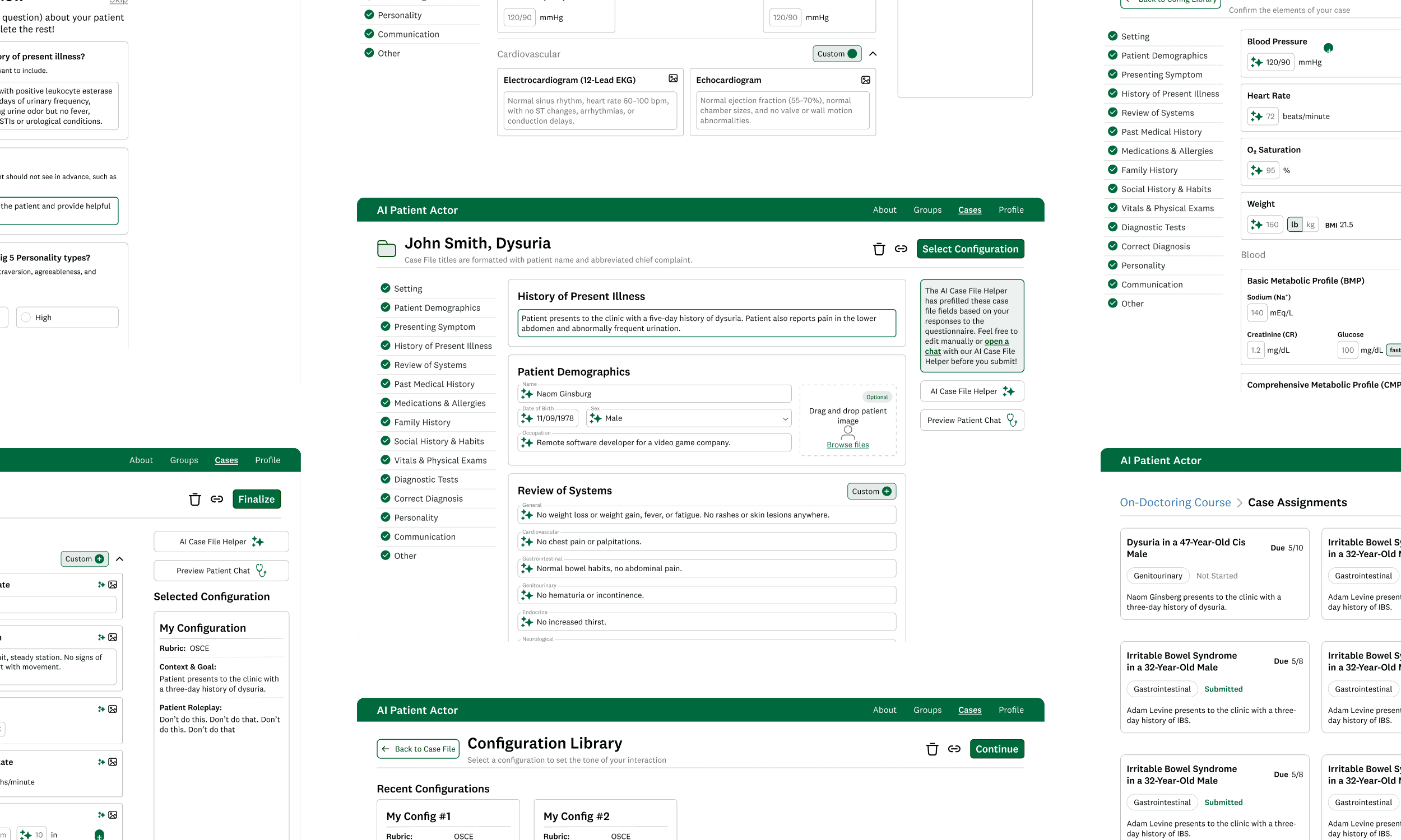

Geisel School of Medicine
AI-Powered Patient Interaction Training
Redesigned the Thesen Lab's AI chatbot, helping medical students practice interacting with patients and developing a diagnosis
end-to-end | edutech | multimodal UX
Spring 2025

DALI Lab - Intro to UX/UI
Gamifying student hydration
Ideated, designed, and iterated upon a mobile hydration tracker and tamagotchi-style pet.
health & wellness | delight | user behavior
Fall 2024
Have a
design role open?
recipe I should try?
project you're excited about?
life-changing restaurant experience?
new skill you're building?
hiking recommendation?
silly cat pic?
travel suggestion?
project you're staffing?