Gamifying student hydration
A digital companion for new college students, supporting mindful hydration habits
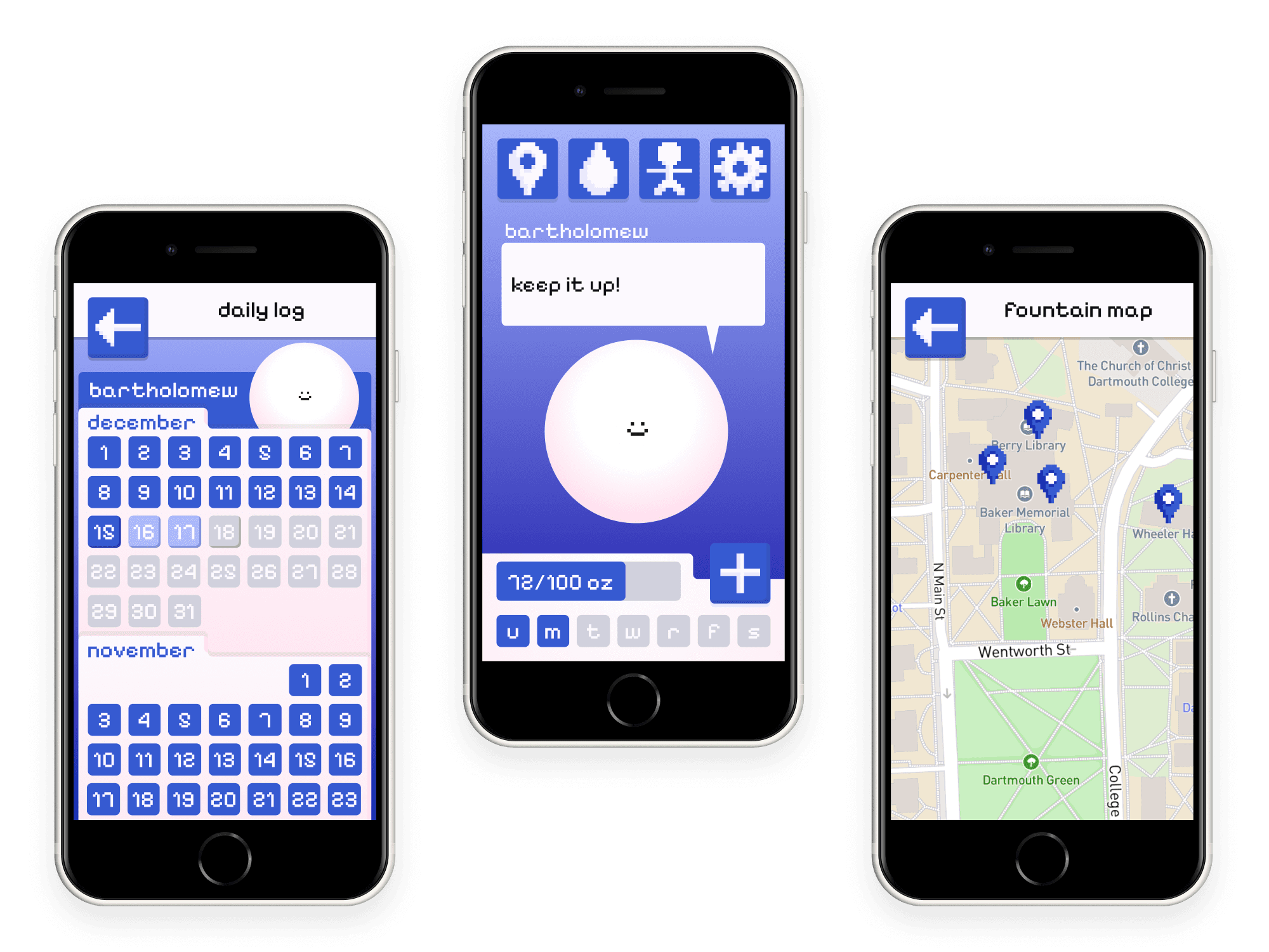
My final project for the DALI Lab's UX/UI Mini-series, a two-week introduction to design thinking, user research, and UX/UI principles. Bartholomew is a tamagotchi-inspired digital pet, where users can log their water intake throughout the day, find nearby water fountains, and receive encouragement from Bartholomew, building mindful hydration habits using consumer psychology.

What is design thinking?
Design thinking is a framework used to identify problems and develop solutions. At the DALI Lab, we follow these 5 steps over the course of a 10-week sprint. This Mini-series was only 2 weeks long, so we engaged in an abridged version. In those two weeks, I brought my hydration companion from interviewing and empathizing with users to a prototyped final product.

It all starts with the user
empathize
I interviewed a few friends to get an idea of how students drink water. I then synthesized these findings into a persona: The Dehydrated First-Year Student.

College kids are smart and busy. If there's a more efficient way to do something, they'll try it out. A successful product for this persona will help target what's causing challenges in their routines, which I further explored in the journey map below.

This journey map identified three key challenges to the process of drinking water:
Drinking water is seen as a chore
Finding a clean water fountain nearby (especially if in a new environment)
Refocusing after returning from a water break
Defining the problem
define
All this research was condensed into a POV statement and three "How Might We" questions. These findings were used to drive feature brainstorming and priority.
POV:
"
New Dartmouth Students need to stay hydrated in order to take better care of themselves/ be more mindful of self-care
"
HMW:
"
HMW: Make filling a water bottle easier?
"
"
HMW: Incentivize drinking water/ make drinking water fun?
"
"
HMW: Emphasize drinking water as a mindful form of self care?
"
Drafting up ideas
ideate
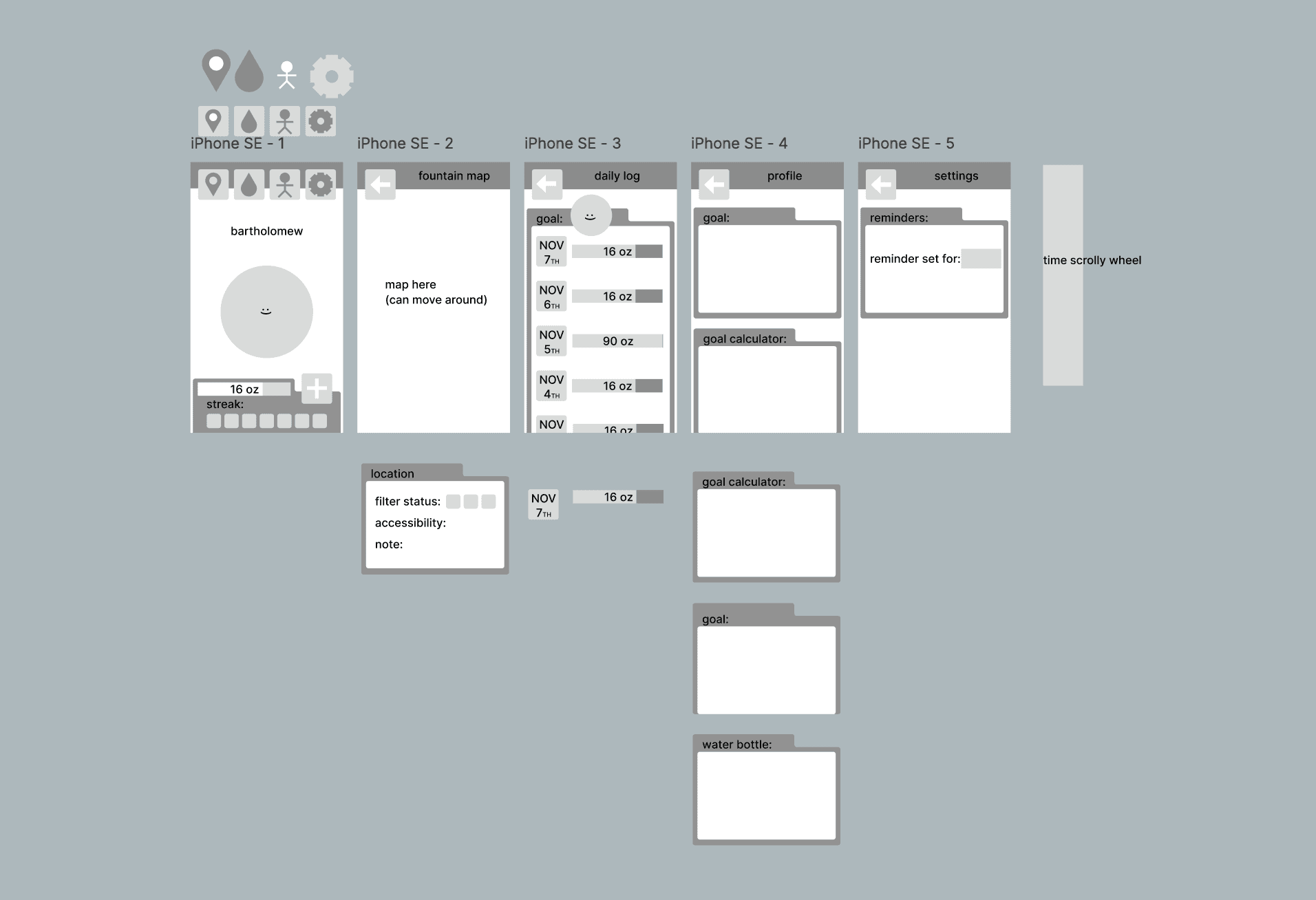
Initial greyscales for "Bartholomew". These were presented to the UX/UI miniseries cohort for initial reactions and feedback.
Features
prototype
Interactive Pet
"
HMW: Incentivize drinking water/ make drinking water fun?
"
Bartholomew, your interactive hydration companion, speaks a variety of messages when tapped. I imagined the finalized product would have a variety of companions to choose from, allowing the user to customize their pet.
"
HMW: Emphasize drinking water as a mindful form of self care?
"
When tapped, Bartholomew says an encouraging message. This could be customized to include self care advice or describe the benefits of staying hydrated, pulling from reliable medical sources.
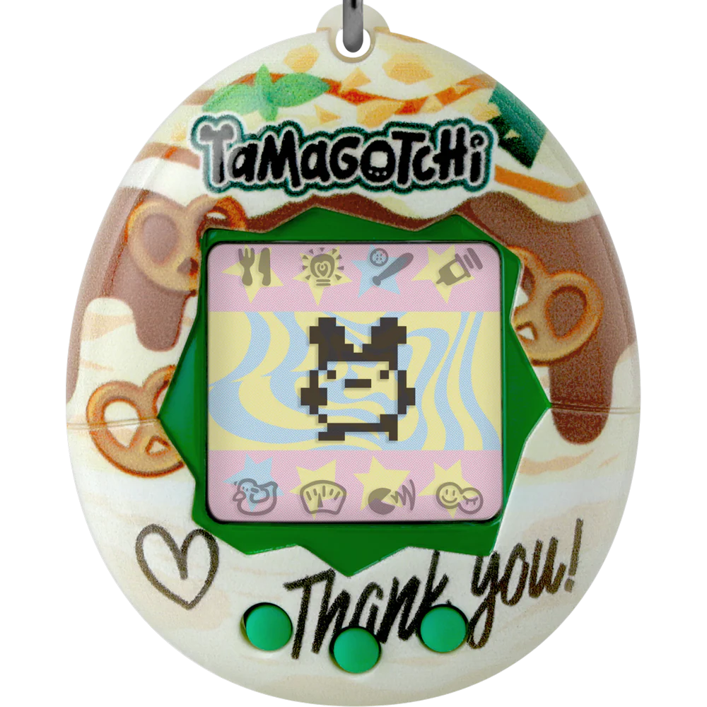
This design was inspired by Tamagotchis, a nostalgic digital pet. Users had to consistently interact with the pet to keep it alive. In order to keep Bartholomew alive, you would have to drink water.
Daily Log
"
HMW: Incentivize drinking water/ make drinking water fun?
"
To track progress over time, the daily log collects the user's hydration history. Each day is organized in a calendar grid and color coded based on if the day's goal is met or not. This goal is displayed as a progress bar and can be set in the profile section.
Students can track their progress at a glance, creating an external pressure to meet their goals, increasing their hydration.
Daily Goal
"
HMW: Emphasize drinking water as a mindful form of self care?
"
Users can set their daily goal and enter the capacity of the water bottles, allowing users to quickly log when finishing a bottle. This page also tracks the number of uses for each saved bottle, providing insights on users' water bottle usage habits.
Students self-evaluate their water needs, encouraging themselves to build the intuition of how much water they need per day.
Fountain Map
"
HMW: Make filling a water bottle easier?
"
A common complaint among interviewees was difficulty finding water fountains, especially if they were in an unfamiliar building or area of campus. The fountain map collects the locations of all water fountains on campus, their filter status, and additional notes, addressing the concern.
This design was inspired by Dartmouth's online campus map and how it displays all-gender restrooms. There's pinpoints all over the map and also information on how to access the location. The fountain map is situated in an already-existing design language to reduce user friction.
Three friends played with Bartholomew
test
I did a short user testing session with Bartholomew, showing the final prototype to them and asking them to perform three particular tasks:
For each of these tasks, I observed:
WHY:
They weren't told what the app was about at first, so this might not be a problem for users who have expectations of what functions the app has, which is how it would normally function.
ADJUSTMENT:
Perhaps users should be briefed on the main functions of the app before user testing.
Testing on individual app icons could help zero-in on the most intuitive version.

"
Ok so this is a map, this is a person so its probably me
"
"
What settings can I edit?
"
"
What does this tear drop mean? I'm assuming its something to do with water
"
WHY:
The prototype only has four screens and not many functionalities. Each task is similar in function to comparable products (such as a big plus button on the homepage to add an entry).
With "Goal Shift", changing your goals is different in every platform, so it took a bit of poking around.
ADJUSTMENT:
Perhaps creating a "change your intake goal" CTA after submitting entries or placing it on the homepage will help direct users to that function.
"
This map works a lot like Google Maps
"
"
Do I go into settings to change my drinking goal?
"
"
I just press this plus button to say I finished my water, right?
"
WHY:
When opening the map, one of the users had to pan around to find the screenshot of the map. Another user was selecting marked locations but the info card was appearing off of the frame, making it look like there was no information.
ADJUSTMENT:
These are just a few limitations of prototyping in Figma. Ideally if this were a fully coded app, the map would snap into place and have external bounds. And info cards would prioritize fitting on screen.
"
Uh, I think the map is broken
"
"
Yeah, that makes sense
"
"
I'm pressing the location but I can't see any information
"

"
Oooh could I have other pets?
"
"
I think if Bartholomew was reminding me to drink water I'd actually do it. I just forget sometimes, you know?
"
"
I really like the style of this! The pixel art is super cute.
"

"
Could there be more interaction with Bartholomew? Reminds me a lot of Talking Tom or Pou
"


What did I learn?
As my first experience with UX/UI design, it was exciting to work through designing a project from end-to-end. My favorite part was definitely the styling of Bartholomew—plus the concept is just a little silly so it was fun to work on.
Still curious?

Geisel School of Medicine
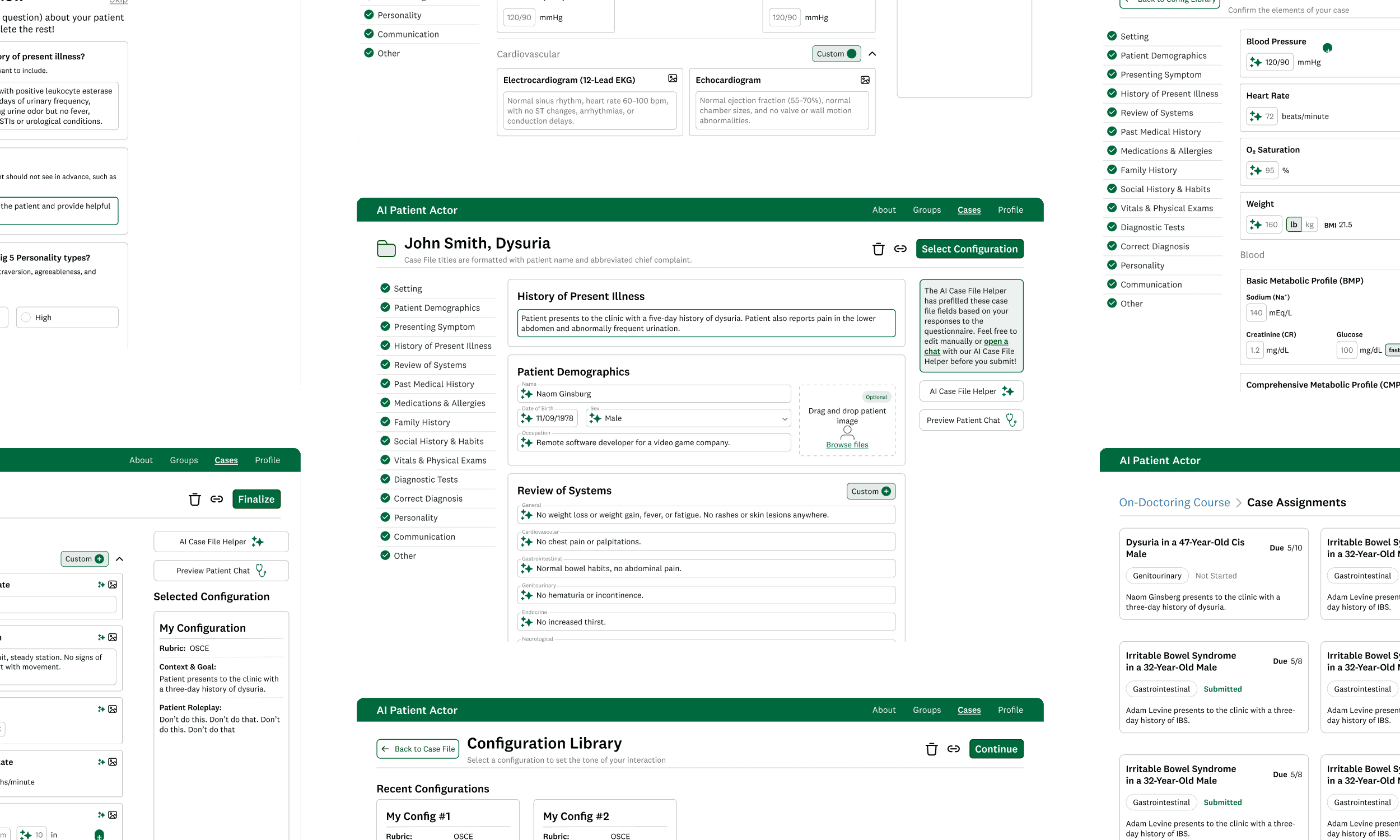
AI-Powered Patient Interaction Training
Redesigned the Thesen Lab's AI chatbot, helping medical students practice interacting with patients and developing a diagnosis
end-to-end | edutech | multimodal UX
Spring 2025

Have a
design role open?
recipe I should try?
project you're excited about?
life-changing restaurant experience?
new skill you're building?
hiking recommendation?
silly cat pic?
travel suggestion?
project you're staffing?